Rhinestone
Rhinestone
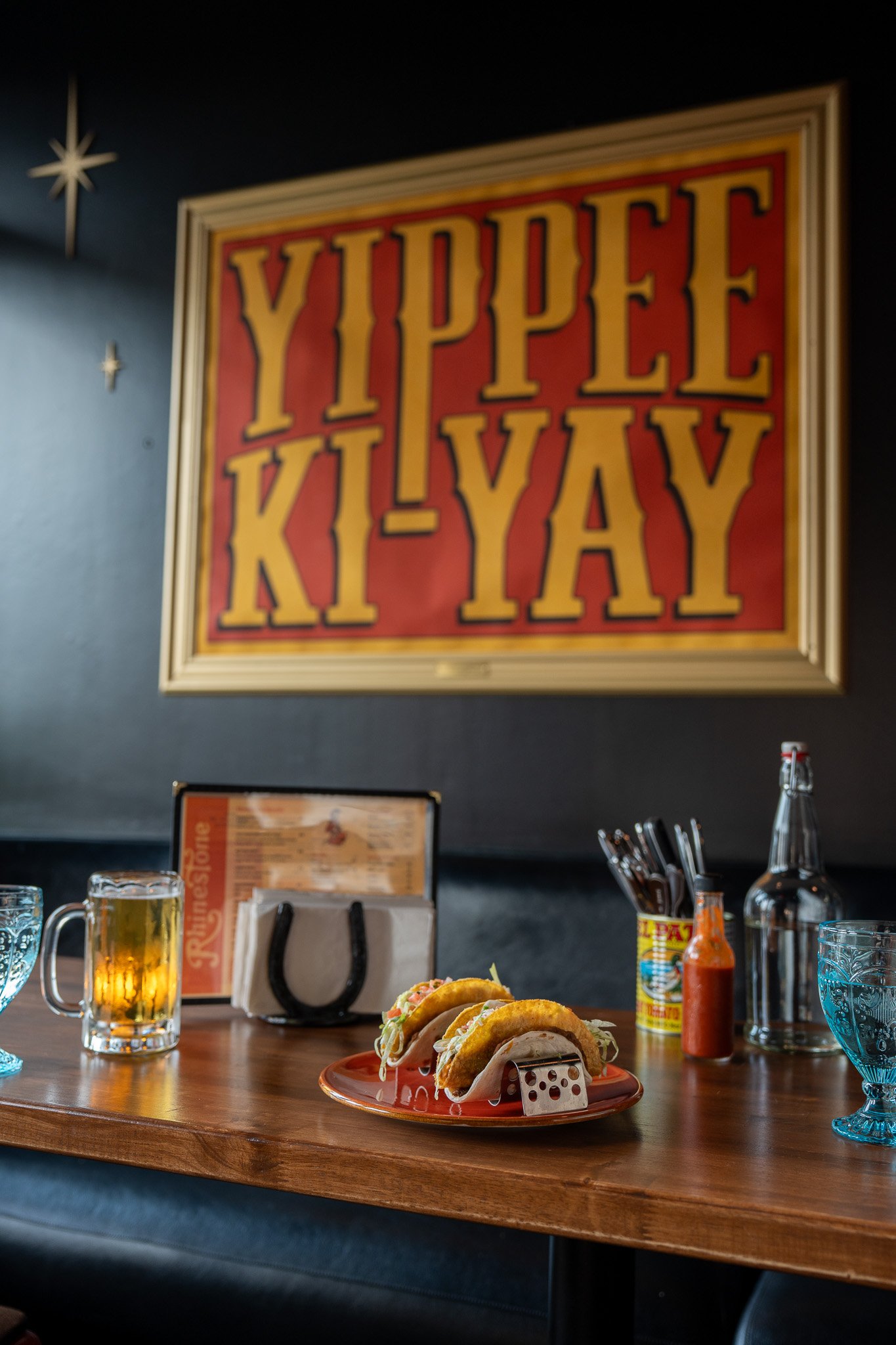
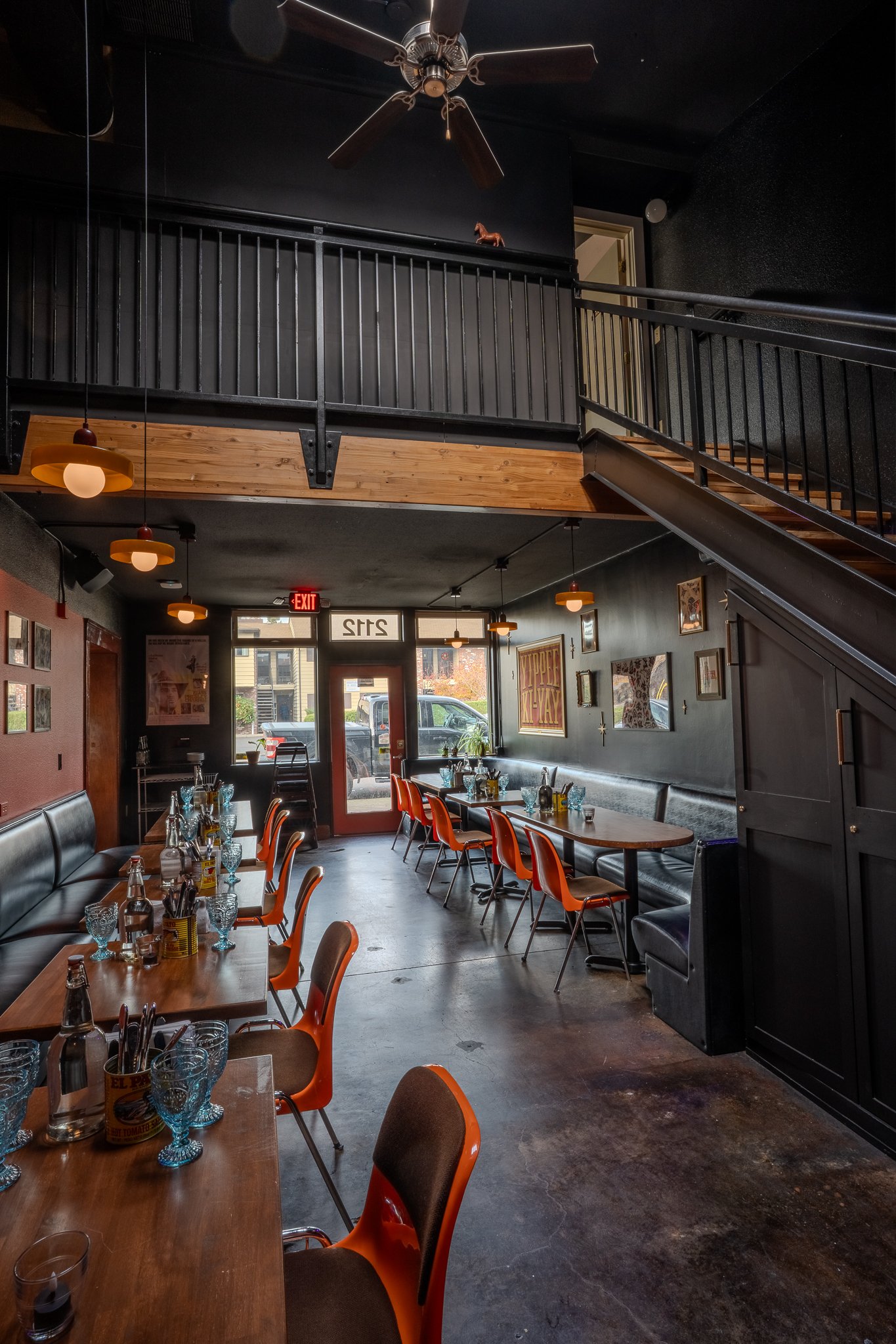
Rhinestone is cow-punk themed pop-up and bar with tex-mex menu and campy cocktails.


Brief
Bartender Trevor Gilstrap and Chef Graham Chaney approched me to create the branding for their cowpunk pop-up concept that was inspired by the 70’s saloons they frequented back in Vegas, but a little flashier. Chef Graham wanted to pay homage to nightlife fast-food staples like the Gordita and Crunchwrap, but make all the ingredients in-house. They needed a cohesive system of colors, versatile and expressive type treatments and mouthwatering photography to help fill the pop-ups and eventually start their own restaurant.
Development
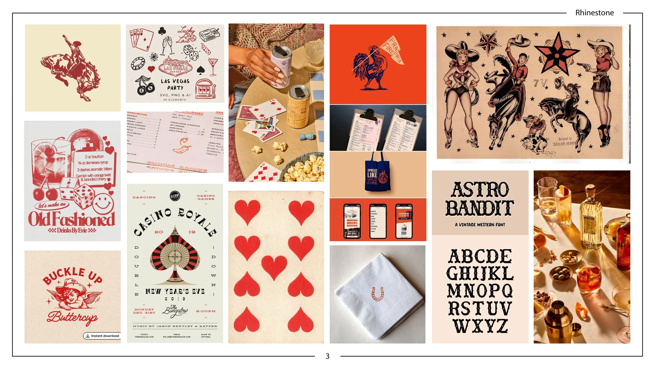
Approved mood board selected from 3 cow-punk concepts.
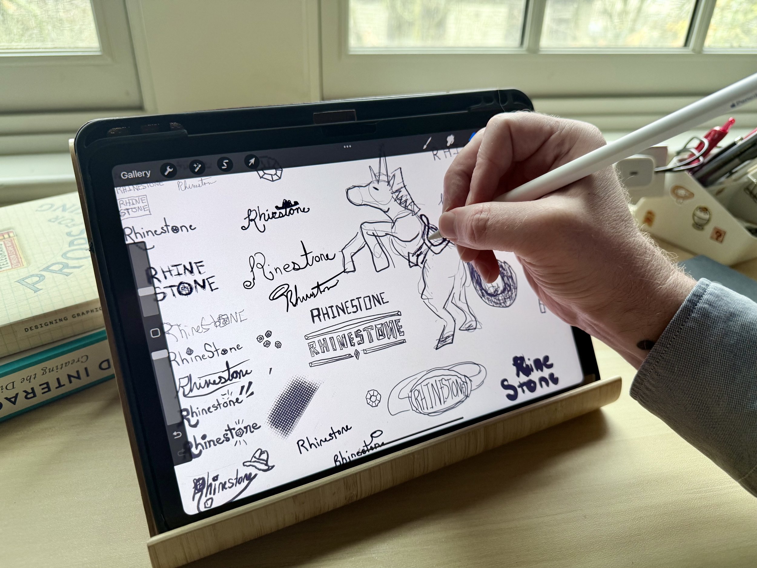
Sketching Logo Ideas
Rhinestone was intended from the start to have a DIY punk aesthetic inspired by the scrappy way chefs need to forge their own way in a food industry where new concepts are usually backed by well-to-do investors. The main inspiration for the branding was inspired by event flyers made with a limited color printing palette. What started off as a red accent color (inspired by tattoo flash) shifted more into orange tones to inspire hunger, and the parchment and dusty black colors evoke the old west cow-boy theming. Both the logo and the heading type have a hand-painted sign quality, while most of the copy has an easy to read modern font. Flavor text and direct messaging is used sparingly with a simple hand drawn script. Clip art graphics from old western comic books are used but treated with colors and textures to match the hand processed punk aesthetic of old flyers. Because of the color palette I wanted to avoid using a literal rhinestone in the branding and instead created a unicorn-bronco that, while not part of the actual logo, is used along side of it let everyone know the personality of the place.
Pitchdeck


Implementation
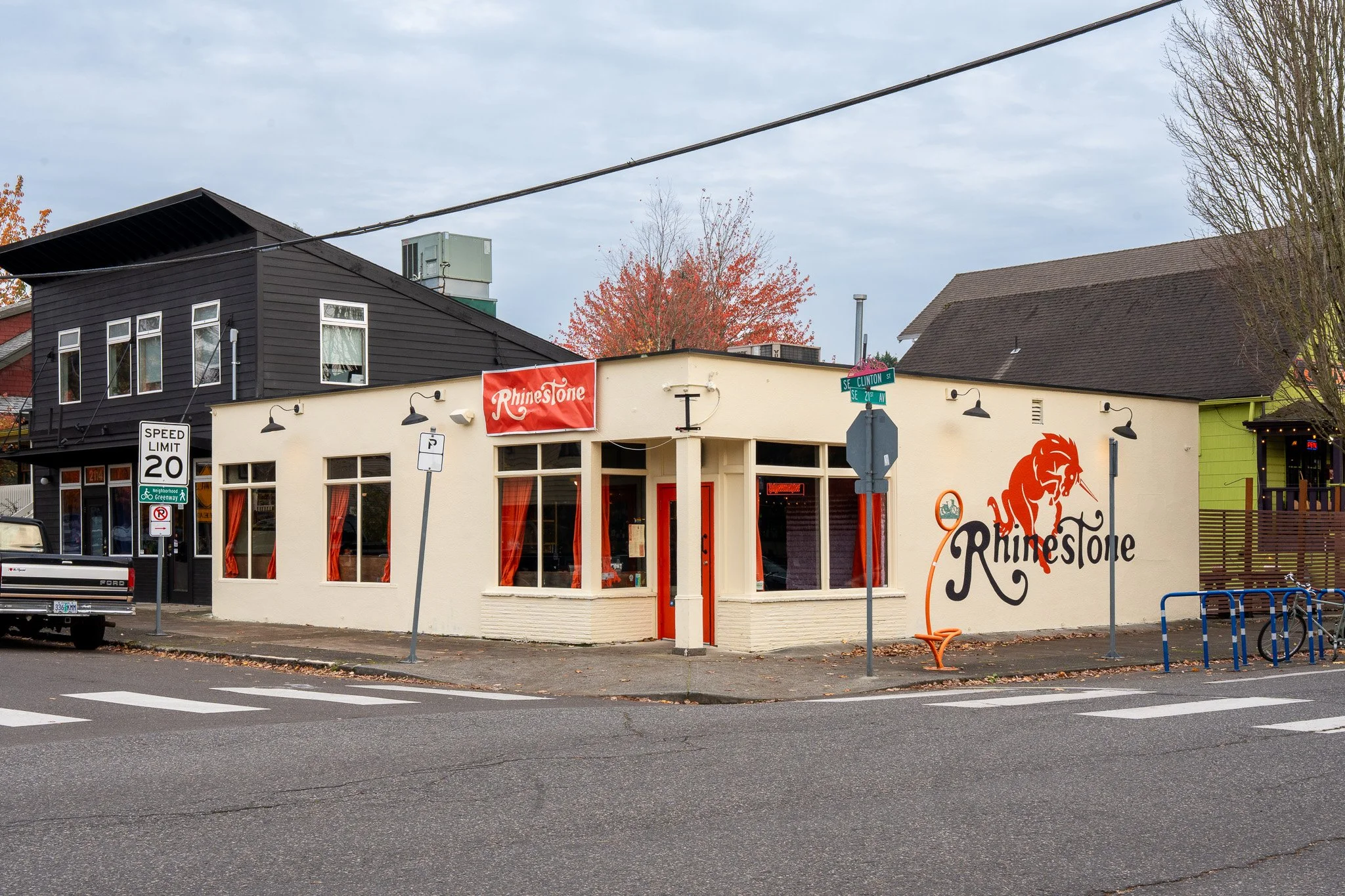
Rhinestone’s pop-ups were so successful they were able to procure their first brick & mortar in about 6 months.